
css样式
@-webkit-keyframes imgTrans {
	0%{
		transform: rotate(0deg);
		-ms-transform: rotate(0deg);
		-webkit-transform: rotate(0deg);
	}
	100%{
		transform: rotate(-360deg);
		-ms-transform: rotate(-360deg);
		-webkit-transform: rotate(-360deg);
	}
}
.icon {
    -webkit-animation: imgTrans 1s infinite linear ;
    -webkit-transform-origin: center center;
    -ms-transform-origin: center center;
    transform-origin: center center;
}
图片
<div>
<img class="icon" src="images/picbig.png" >
</div>
标签: 360度旋转
上面是“css3实现360度旋转”的全面内容,想了解更多关于 前端知识 内容,请继续关注web建站教程。
当前网址:https://m.ipkd.cn/webs_1452.html
声明:本站提供的所有资源部分来自互联网,如果有侵犯您的版权或其他权益,请发送到邮箱:admin@ipkd.cn,我们会在看到邮件的第一时间内为您处理!

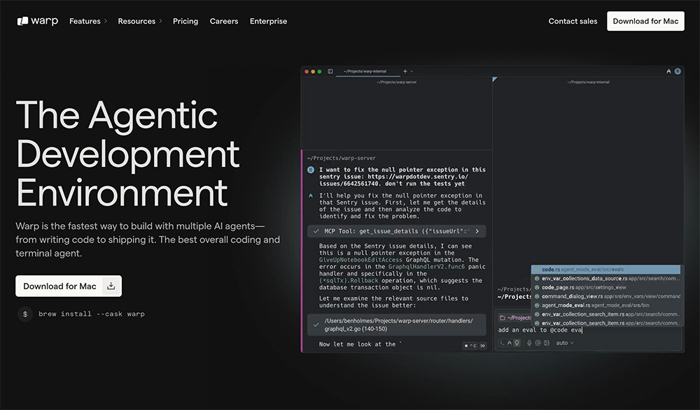 Warp:一款专为开发者设计的现代化终端工具,支持多种命令行工具
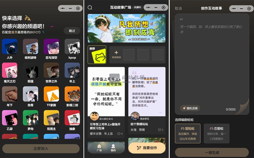 上头蛙:腾讯打造的微信生态沉浸式AI互动剧情创作平台
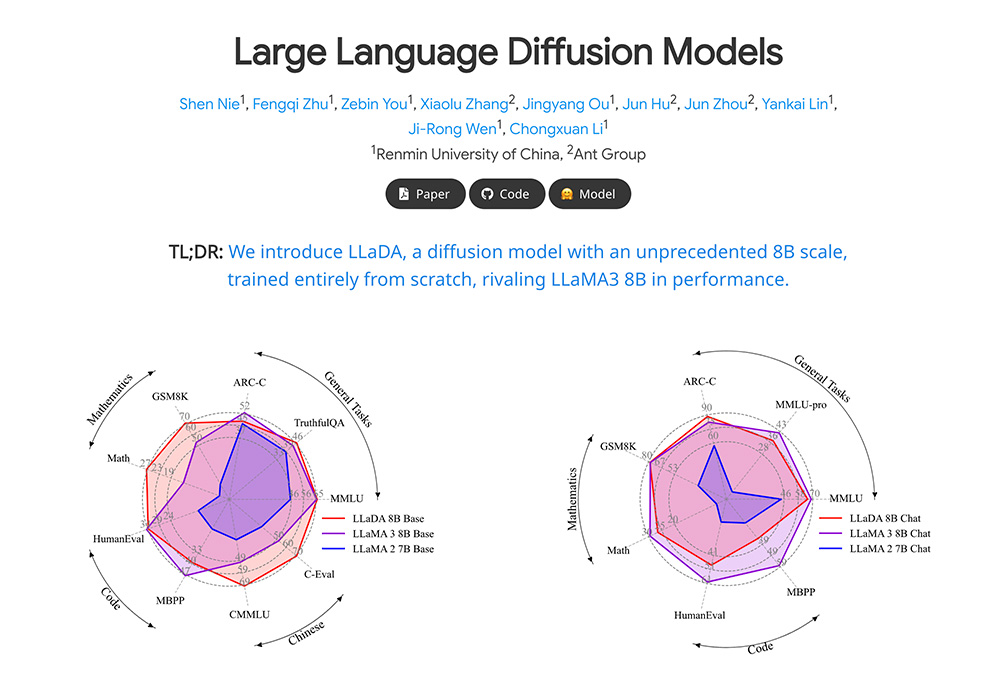 人大高瓴AI联合蚂蚁推出LLaDA,打破大语言模型“逆诅咒”
 flysheep资源避难所官网入口,一个二次元风格游戏下载的站点
 速创猫AI工具箱,提高用户在求职、写作、翻译等方面的工作效率
 航旅纵横:为旅客提供从出行准备到抵达目的地的全流程信息服务